Games
| Dystopian negotiation game with a photorealistic film noir art style. Set in an original dark fantasy world inspired by the works of China Miéville and Ursula K. Le Guin. |
| Roles | Project Lead Lead Artist, Writer and Programmer |
| Engine | Ren'py |
| Languages | Python Ren'py DSL |
| Art | Clip Studio Paint EX Adobe Photoshop |
| Narrative Design | Inkle/Ink |
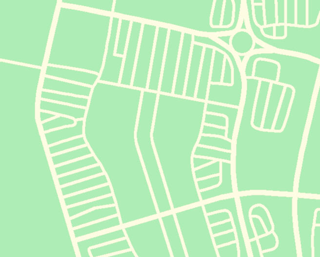
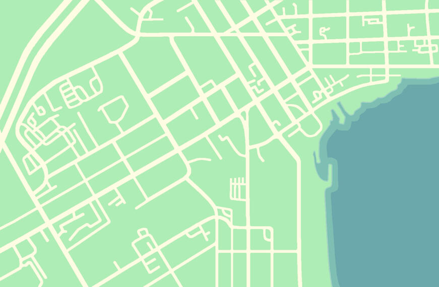
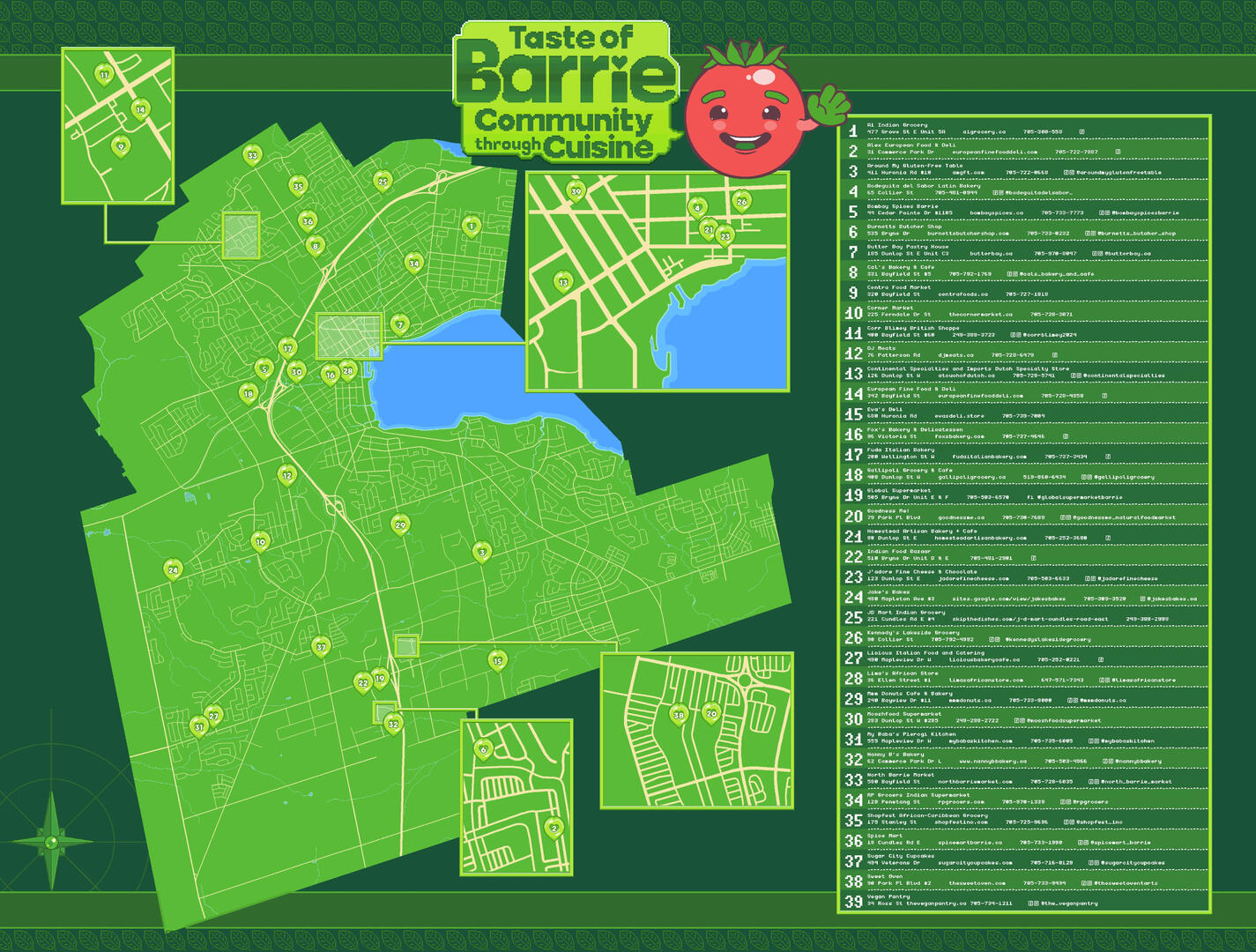
| An interactive, gamified map designed to support local independent food providers in Barrie, ON. Developed as a community art project with the support of 880 Cities, Balsam Foundation, and Ontario Community Changemakers (OCC). |
| Roles | Project Lead Lead Programmer Lead Animator & UI/UX Designer |
| Engine | Godot |
| Languages | GDScript |
| Art | Clip Studio Paint EX Aseprite |
| A queer punk thrifting simulator with a Y2K aesthetic inspired by dress-up browser games of the mid-2000s. Developed in ten days with AstralLamb for the Girly Game Jam under the theme "Collect Them All." |
| Roles | Lead Programmer UI & Collectable Art Sound Design |
| Engine | Godot |
| Languages | GDScript |
| Art | Clip Studio Paint EX Aseprite |
| Puzzle adventure game with detailed, top-down pixel art. The soft, muted aesthetic belies a mature storyline with themes of mystery and psychological horror. |
| Roles | Solo Developer |
| Engine | RPGMaker MZ |
| Languages | Javascript |
| Art | Clip Studio Paint EX Aseprite |
| Narrative Design | Twine |
| Level Design | Tiled Map Editor |
| Hybrid visual novel/management game about working as an assistant at an otherworldly petshop that harbours a dark secret. Developed in one month with Feardeer for the Amare Game Jam. |
| Roles | Lead Writer Environment, Creature & UI Art UI Programmer |
| Engine | Ren'py |
| Languages | Python Ren'py DSL |
| Art | Clip Studio Paint EX Adobe Photoshop |
Taste of Barrie:
Community through Cuisine
I was the lead programmer and animator on this project, working with GDScript in Godot to build a browser-friendly interactive experience. I also set the artistic direction with a clearly defined colour palette, and UI/UX design created to align with accessibility guidelines.
As lead animator, I developed a set of 2D animated rigs and templates for the character artist, Daya White (aka. AstralLamb). She used these templates to create visual assets for 32 animated "grocery friends" to represent different Barrie locations. I then implemented Daya's assets, and adjusted the rigs to accomodate her stylistic choices.
Designing Engaging Map Interactions
The Taste of Barrie map invites users to create their own fully customized grocery quest from a selection of world cuisine, ingredient categories and dietary restrictions.The user begins map traversal as an adorable tomato, and collects a new "grocery friend" each time they discover a fresh location. Users can select any of their collected grocery friends from the top menu to change their avatar.Each location offers detailed information about a local independent food provider. The map automatically detects if any of the ingredients sold at the location are present on the user's grocery quest, and offers the opportunity to add them to the user's list.
I conducted research on-location to assemble data on all of the independent food providers in Barrie, including their respective offerings, location details and contact information. This data was analyzed and divided across multiple spreadsheets to develop a consistent format for storing and communicating map details.
The in-game maps were created by hand while cross-referencing GPS data and Barrie City Council records. Ultimately, I even updated the profiles on Google Maps and OpenStreetMap to reflect the most up-to-date regional information!
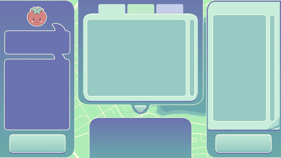
The graphical user interface was designed to strike a careful balance between accessibility and soft, friendly pastel aesthetics. It features large buttons, smooth movement, and text (including external links) that can be directly copy/pasted into digital notepads and to-do lists for ease of use.
Rotten Life Retro

Designing the UI
I painted the UI elements in Clip Studio Paint EX to loosely resemble the product design of mid-2000s electronic toys. The push button animations and accompanying sounds were made to amplify this effect.
In order to simulate the queer punk thrifting experience, the game was designed with three panels:
A traversible screen with directional buttons to explore the thrift shop.
Each clothing item is a unique button that disappears while it is being worn. This enables the clothing items to hide patch and pin collectibles.A screen to store collected patches and pins.
Each item on this screen is draggable, and can be placed anywhere on the character in the third screen. A return button makes it easy to remove draggable objects as the player tries on different item combinations.A screen for displaying the protagonist as they try on different outfits.
Items throughout the store are assigned to layers, and the corresponding layer buttons allow the player to easily toggle them by type. Certain items (i.e. accessories and make-up) are also layerable within their category in order to facilitate player creativity.
Subtle sounds and animations simulate putting on/taking off the items.
A checkout button opens the selfie screen, where players can choose from a range of backgrounds to screenshot the outfit they've designed.
I created a series of Y2K-themed backgrounds to compliment AstralLamb's artwork. We made use of a unified colour palette and a shared library of Clip Studio Paint brushes to maintain a cohesive overall look throughout our 10-day development timeline.Together, we committed to the vibrant colours and bold patterns of maximalist punk.
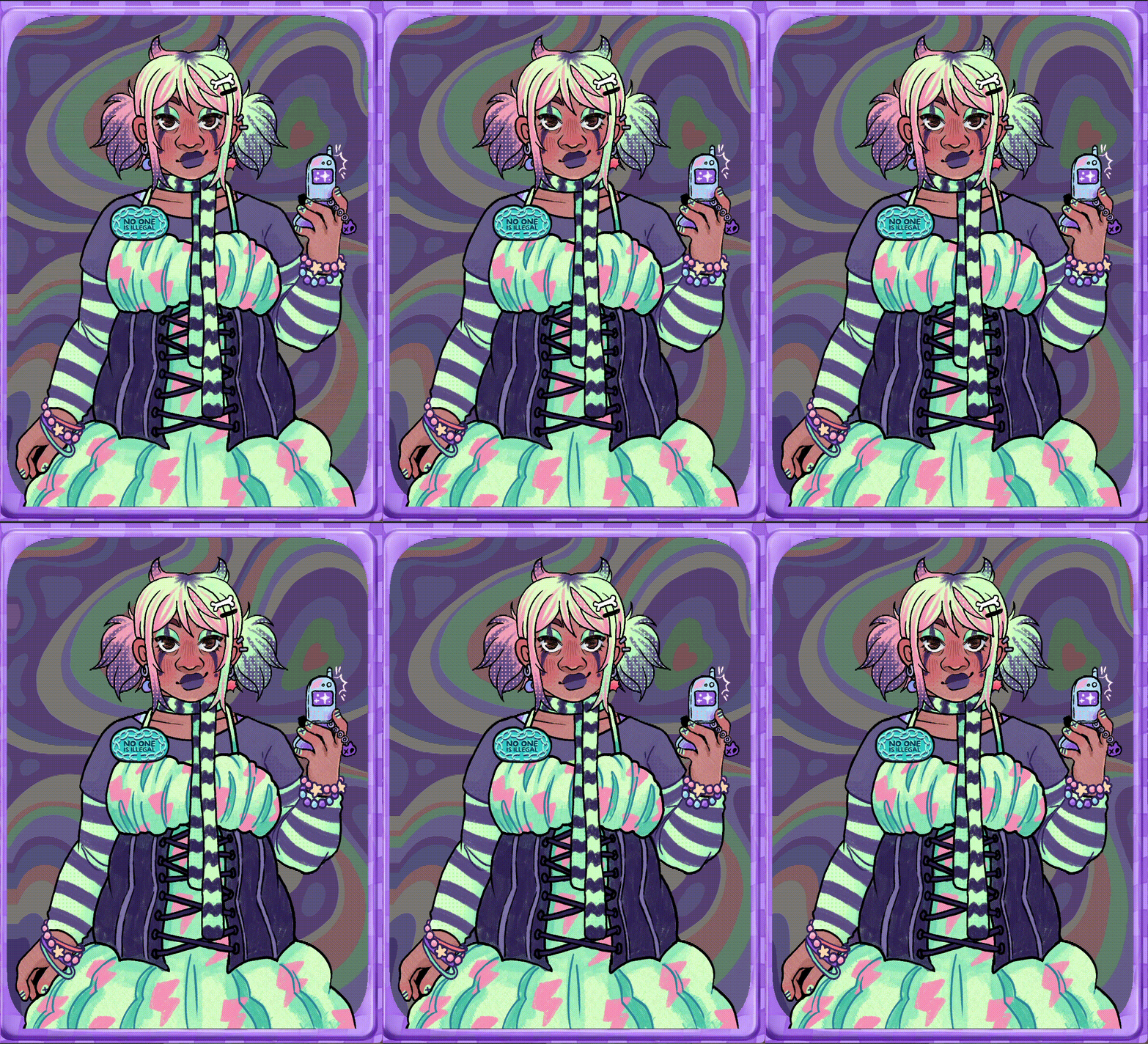
These backgrounds were implemented with an original Godot shader to mimic the scanlines of electronic toy screens from the same era.
Destroy Your Demon
In-game Screenshots
Nicholai A. Melamed (they/them) is a multidisciplinary artist, game developer and community organizer.Many of their projects centre multi-ethnic transgender immigrants on a path of reconciliation with the spaces they once called home. They speak to the interwoven topics of disability justice, sex-positive approaches to queer intimacy, and poverty alleviation viewed through an intersectional lens.Nicholai has been the recipient of grants from numerous organizations, including the York Region Arts Council, Qweerty, Pixelles, and the Ontario Community Changemakers Program. In 2025, they were admitted to the first cohort of the competitive GAMERella mentorship program for emerging game-makers.Nicholai is also as an internationally-published author and illustrator. Their work has been featured in award-winning books with Microcosm Publishing and TO Comix Press, as well as a community resource with Jessica Kingsley Publishers.
Contact Nicholai for work at nicholai.a.melamed@gmail.com
or follow the mailto link below in a supported browser:
Publications
2025 / illustrator for Tevet / Radical Jewish Calendar
2024 / comic artist & author of This Teapot for We All Belong / Trans Wellness Ontario
2023 / medical illustrator for Gender Confirmation Surgery: A Guide for Trans and Non-Binary People by Edward Whelan / Jessica Kingsley Publishers
2022 / author & illustrator of Experience Points / Microcosm Publishing
2021 - 2024 / cover artist for the Queering Consent series / Microcosm Publishing
2020 / comic artist & author of You Are My Home for Home Sweet Home Anthology / Corn Maze Press
2020 / illustrator of The Peyton House Etching for Gothic Tales of Haunted Futures / Renegade Arts Entertainment
2020 / writer & illustrator of Bruxism for Invisible Illness: Depression / Invisible Illness Anthologies
2019 / comic artist & author of Torontovka for Shout Out Anthology / TO Comix Press
Exhibitions
2024 / Worlds AIDS Day Artist Showcase / Gilbert Centre & Creative Nomad Studios
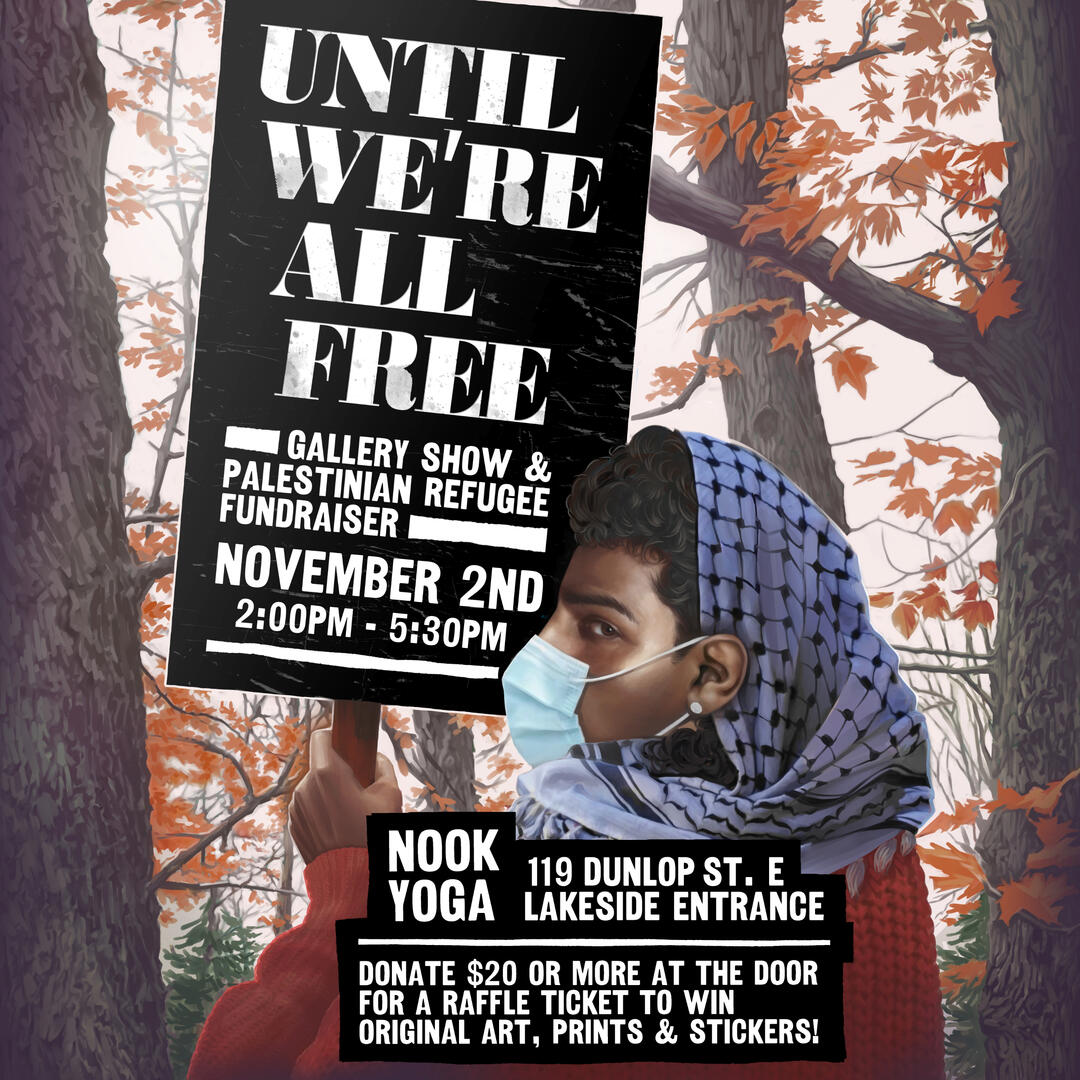
2024 / Until We're All Free: Gallery Show & Palestinian Refugee Fundraiser / Nook Yoga
2024 / A Love Letter to Palestine / Shway Shway Collective & Three Dollar Bill
2024 / Innisfil Artistic Intelligence Public Art Project / Innisfil IdeaLAB
Technical Skills
Digital Art & Animation:
Adobe Creative Cloud (Photoshop, Illustrator, InDesign, After Effects, Premier Pro)
Affinity Suite (Photo, Publisher, Designer)
Aseprite
Clip Studio Paint
Inkscape
Web Development:
CSS & HTML, Javascript, Jquery, Python, Typescript, Wordpress
Software Development:
GDScript, Javascript, Lua, Python, Typescript
Game Engines: Adventure Game Studio (AGS), Godot, GDevelop, Ren’Py, Twine, Pico-8, Pygame
E-Learning & Instructional Design:
Adobe Captivate, Articulate Storyline, Lectora
Traditional Media:
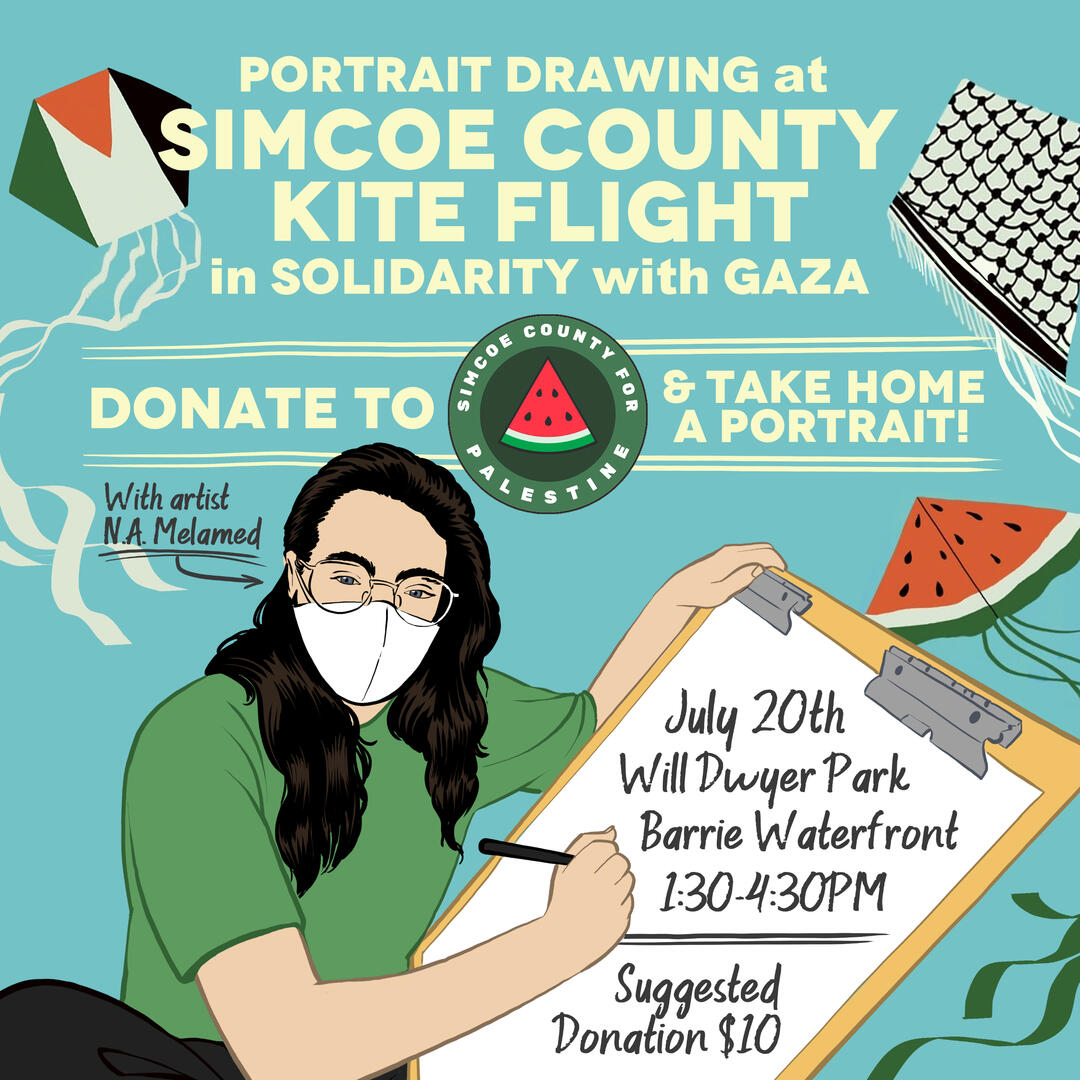
Live portrait sketch artist for outdoor events
Traditional ink and oil painting
Copywriting, content editing and sensitivity reading
*Full CV available upon request.
Graphic Design
Many of these works were created in collaboration with grassroots social justice initiatives and non-profit organizations.

Gallery Show Poster

Ukrainian Solidarity Front Logo

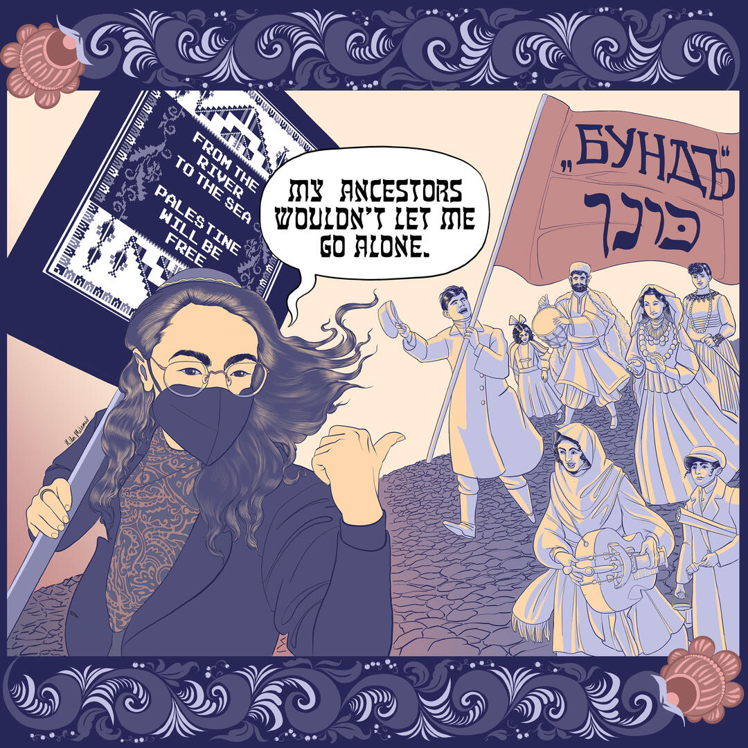
Radical Jewish Calendar Illustration

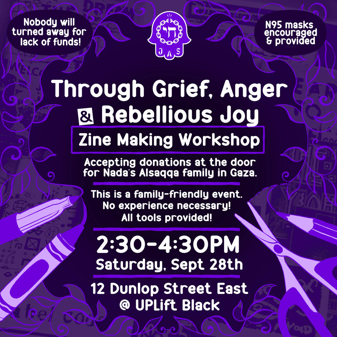
Zine Workshop Event Poster

Dignity for Palestine Poster

Ukrainian/English Land Sovereignty Poster

Floral Border for Client Commission

Access Needs Sticker

Experience Points Poster Art

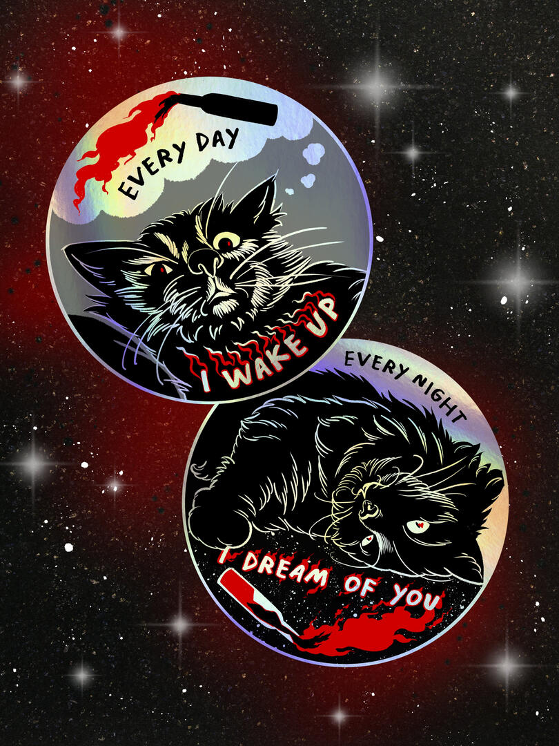
Sabo Cat Stickers

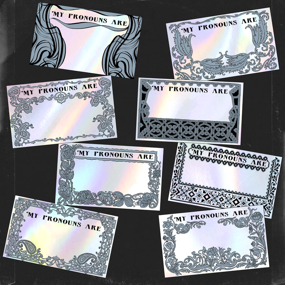
Pronoun Tag Designs

Experience Points Kickstarter Promotional Art

Family Picnic Fundraising Event Poster

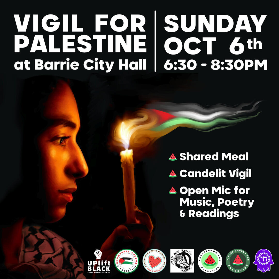
Vigil Event Poster

Barrie Independent Food Providers Map
Life Drawing Workshop
This page exists to highlight my work as a drawing instructor.For tutorials related to game development, you can find my dev logs here. For more general entries about writing and worldbuilding, you can check out my kofi blog here.
Process for Drawing from a Model
In the summer of 2019, I organized and ran a series of costumed life drawing workshops geared towards illustrators, animators and comic artists.The following is a collection of selected promo art for individual sessions and the workshop series as a whole:
Transcribed 2019 Drawing Tutorial
As many of you may already know, I organize costumed figure drawing sessions in my current town of Newmarket, Ontario. One of my side projects over the past few months has been creating portraits of our models to promote each session. For this session, I’d like to share my drawing process on our most recent promo portrait—the one of Euphoria Blackwood.Let’s begin with the under-drawing:
At this stage, I’ve received several selfies from the model in partial costume. I will not be sharing them for privacy reasons, but suffice to say- they have provided me with the suggestion of a pose, the make of the sword, and the model’s proportions and facial features as reference material. I am about to combine these elements with a bit of artistic license to create something that looks very different.Some reasons why I will not (and do not advise) tracing directly over photographs when drawing characters, but rather doing an under-drawing, and working off of that instead:1- A camera lens will always distort proportions. A selfie taken by hand will always have especially distorted proportions.2- Tracing from photos indiscriminately, even when done with a good eye for anatomy, will always make your figures look stiffer. Rounder, more dynamic lines (of the kind you find in quick gesture drawings) make characters look more alive, even if they are not 100% anatomically correct. In fact, breaking from anatomic correctness is sometimes necessary to make an action pose look more “real” to prospective viewers!Now on to my thought process for the under-drawing itself. Here are some things I am choosing to place as reference points for the drawing that I am about to do over top of it:1-Proportional reference
I want to know the size of the head in relation to the torso. The torso in relation to the hips. The relative size of the shoulders and arms. How the head is turned (a subtly menacing down-turn in this case), and where the features rest on the face in relation to one another.2-Composition
For me, this means where everything is going to be placed in this drawing to make it look aesthetically pleasing to the viewer, and draw attention to the important bits (face and hands, in this case). Are the elements in balance? On a whim, I add the suggestion of a little dragon border here to balance out the blockiness of the text.Now I am ready to begin making this tangle of lines into something resembling a human.
Oof. Looks like a lot happened there, right? Don’t panic. I am about to explain this part too, piece by piece.To start with, I have left the under-drawing visible here in a shade of red. I want you to be able to see how that first series of lines inspired the more certain, detail-oriented lines over top of them.I am about to draw a very different costume from the one the model has sent to me, based on a later conversation between us. What you aren’t seeing in the way I draw the clothing is that prior to adding folds, zippers, and other minor details, I make a point of drawing out the shape of the arms and torso more precisely, and figuring out which surfaces are facing what. Folds come into existence where two parts of the body naturally overlap. I am thinking of how the underlying bones have to be positioned to make that pose, and once I know that, the rest is like a montage of muscle and skin gradually assembling itself inside my head, until I reach the leather jacket on top. You can’t see this happening on the page because practice with structural drawings of the human body has trained me to see and apply it without going through every step of drawing bone, muscle and so on. My knowledge is very, very far from perfect (this is why I still use plenty of references in character drawings from imagination- I need to regularly remind myself of how the human body moves). But it is just enough to know what arms and shoulders must do in order to hold a sword. Same goes for the hands. I am thinking of what precisely the knuckles and finger joints need to do to actually grasp that hilt. Even if that’s not obvious yet, It’s something I will need to know once I start shading.Full disclosure about the face and hair- I open the file containing the model’s initial selfie again, and keep it open alongside my drawing as I’m working, glancing over occasionally to make sure there’s a resemblance. Sure, that’s not exactly her initial expression. And her hair isn’t exactly flowing gloriously in the imaginary wind of what I presume to be a bedroom. But what’s the point of being an artist if you can’t confabulate a bit to make things look more cool? I draw with the intention of creating something that makes the model think “Damn, that makes me look like a badass.” With hair, I especially like to add little flyaways to make it messier, and hence more “real” without actually being very real at all.Once it comes to the little demon, I realize I have in mind the draconic corner flourishes of medieval texts. I look up a few of these on google images and Pinterest, trying to assemble a general idea of their appearance in my head without actually going through the motions of drawing a series of concepts in my sketchbook. Yes, this is laziness, but let’s be honest- we all have limited time. And I have just enough time to analyze the elements that make them what they are. This goes on for about fifteen minutes, until I feel ready to attempt a drawing that borrows from these stylistic elements, without copying any one style or image. The results of my google search remain open in the corner of my desktop as I draw. I occasionally glance through them when I’m uncertain about something, like the shape of a wing.Now I am ready to shade.
There’s quite a lot that’s gone into this next part. More, admittedly, than I can explain in detail given the limitations of this post. But I will do my best to cover the broad strokes.I’ve probably spent more time training myself to shade based on pure intuition than any other element of this process. This means I don’t bother to look up a lighting reference. I do, however, look up a few images of leather jackets to remember what the texture looks like, since I know it responds in an interesting way when reflecting light.Mentally, I position the light source somewhere in her top right (the viewer’s left). This is quite different from the initial selfie, but I want the model’s face to be more visible, and for the way the light falls on her jacket to appear more dramatic and intentional. I have in mind something midway between well-fitted clothing and armour.Now it’s important to note here that this drawing is entirely black and white and the shading is done in an ink-based crosshatching style. I’m making a point of saying this because it presents a special set of challenges different from a full-colour or painted piece. To start with, I need to be very careful about value. The depth of the black and the size of the pen stroke will determine whether this all-black jacket looks like a coherent piece of clothing, or an inky blob.I think about which parts will need to have the deepest black, and fill them in first. This gives me a point of reference for how light and dark everything else will need to be. I then make a point of thinking about major highlights and areas of reflected light. The limitations of the medium prevent me from outlining them. Instead- I have to make a mental note of their position and draw around them. Anxiety-inducing? Sure. But I like to think the final result will be worth the trouble. It’s a style of art I really love.Another important aspect of crosshatching is drawing lines that follow the direction a surface is facing. For example, there is a side of the arm facing inwards towards the body, and a side facing the viewer. I need my linework to reflect that difference. However, I also know that humans arms are not rectangular blocks, so this needs to be represented in a series of concentric motions of the pen. For the darker areas, I then add the next layer of pen strokes. These ones face stubbornly in the opposite direction. They trick the eye into thinking “this area is in deeper shadow”.Some of the lines appear more “random” in their positioning than others. This is to account for the inherent messiness of real-life textures. There is no good way of figuring out how to position these “random” lines in a drawing, except through experimentation (and potentially, years of practice). Some artists will describe these parts of a drawing as “happy accidents”. The secret is that they are never truly random or accidents. They are elements of the drawing guided by intuition, rather than conscious thought. Good Intuition about drawing takes time to develop over long periods of experience and failed attempts, much like intuition about people’s intentions. We may not realize it’s happening, but every human interaction over the course of our lifetimes contributes to forming that intuition about people we encounter for the first time. Drawing is the same.And that concludes the process!
Full-Colour Illustration

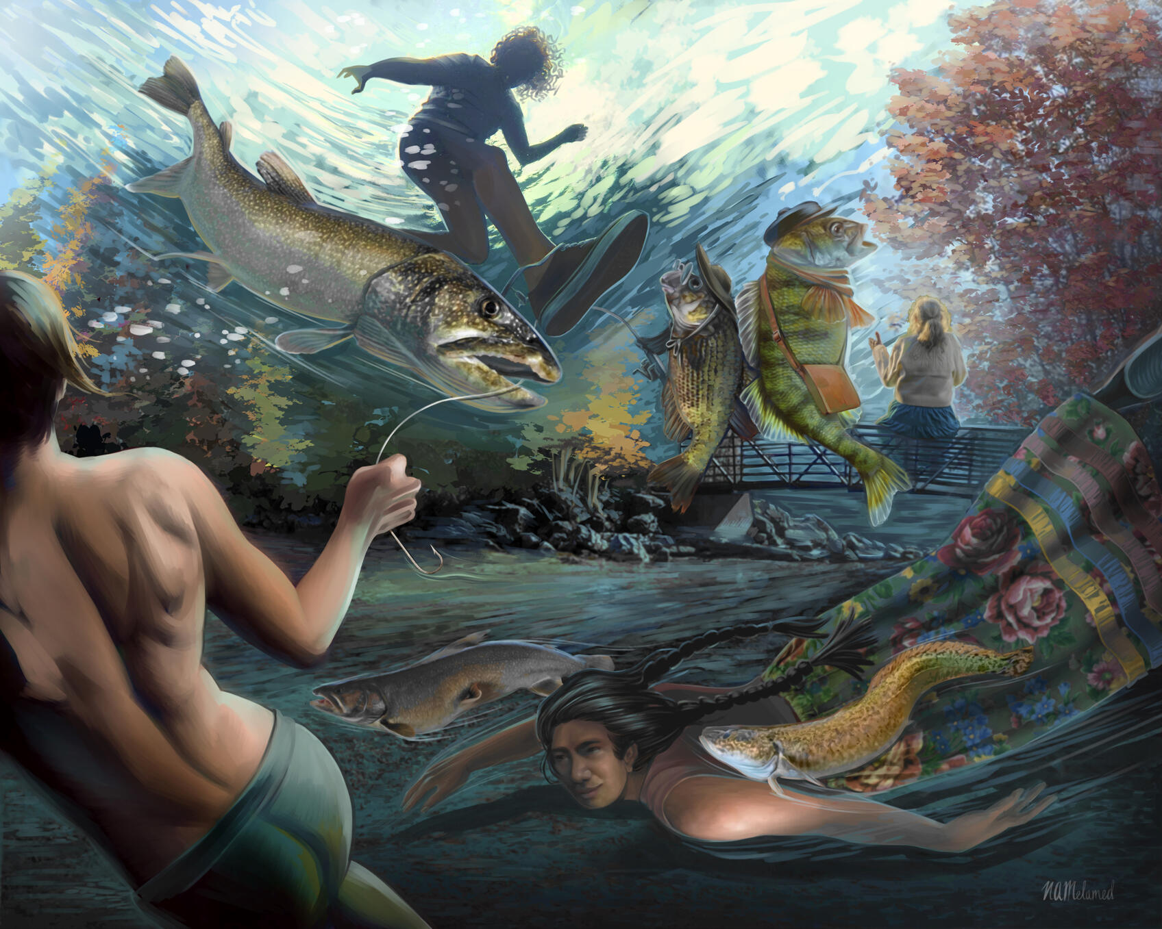
First We Must Dream (Innisfil ideaLAB Mural)

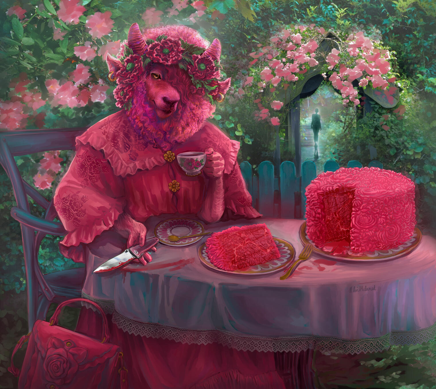
At the Garden Gate (Contest Illustration)

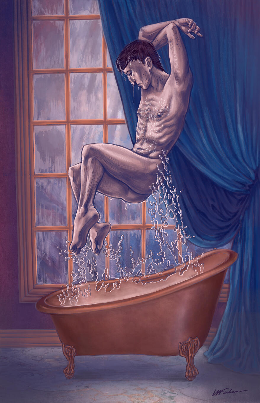
The Hedgewitch Becomes a Sorceror (Interior Book Illustration)

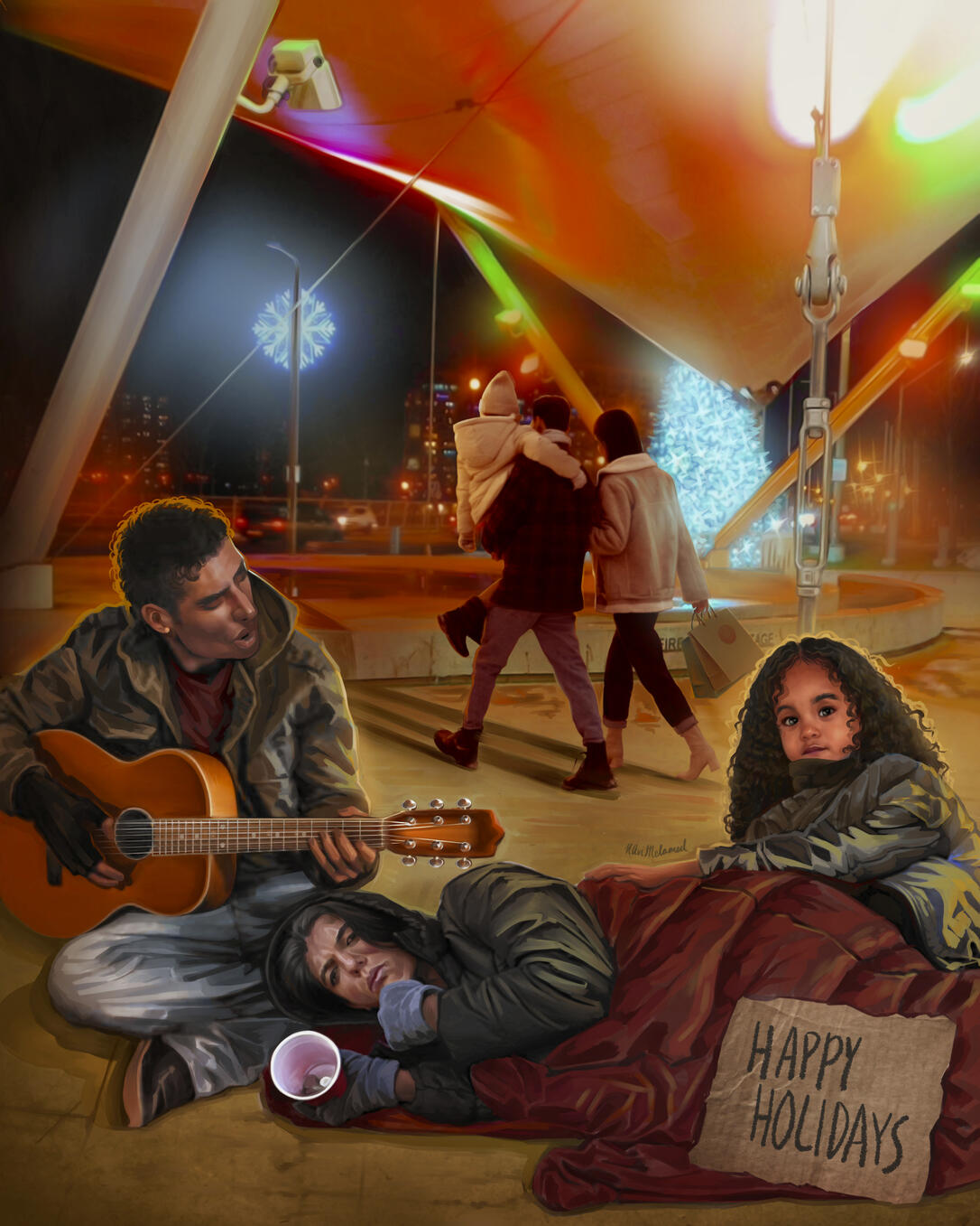
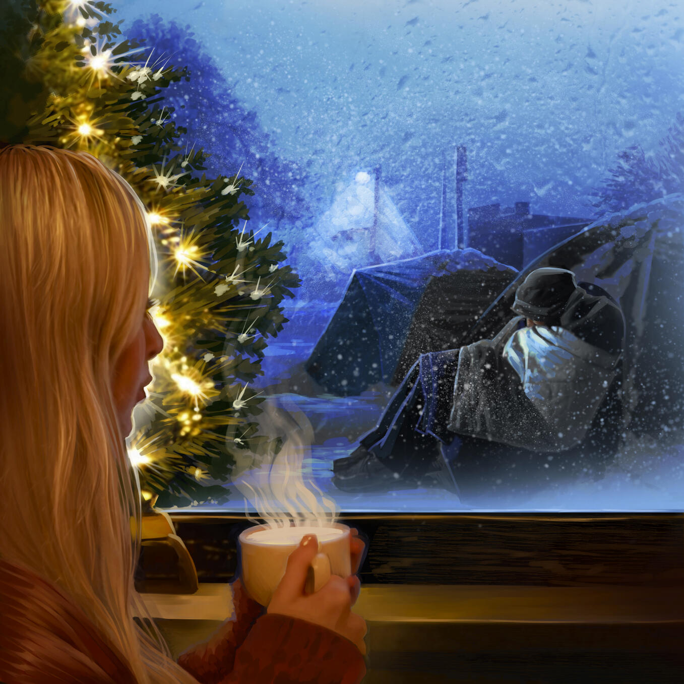
Happy Holidays (Advocacy Illustration for local community service providers)

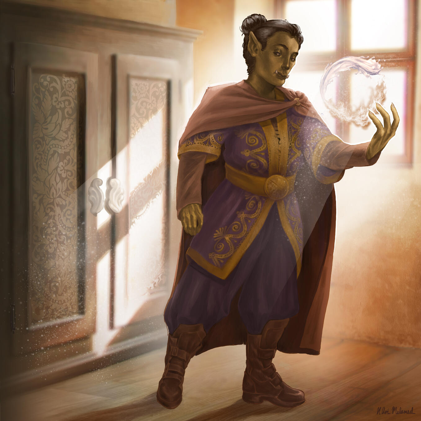
Garak the Monk (D&D Illustration)

Feardeer (Gift Illustration)

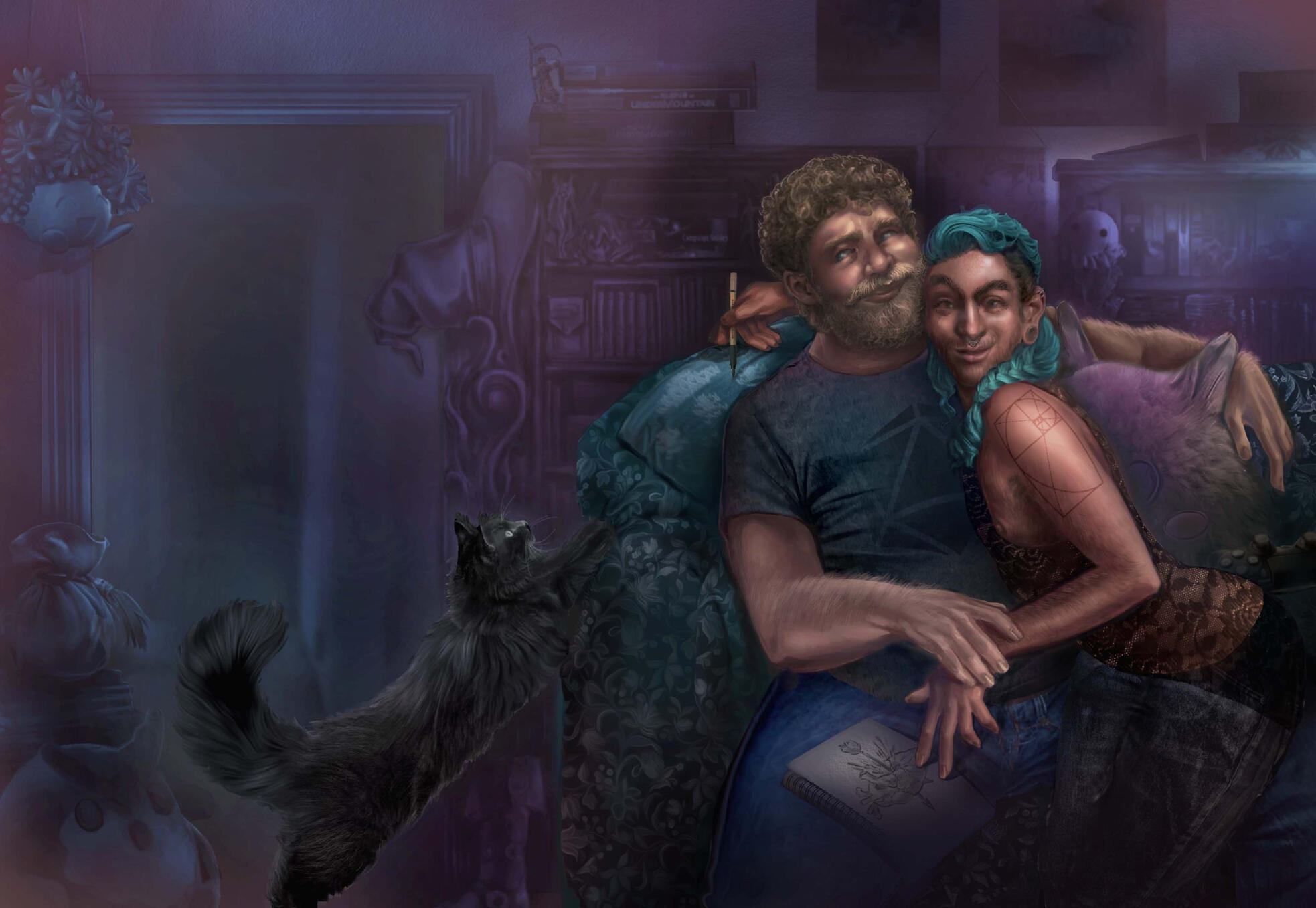
Experience Points (Wraparound Cover)

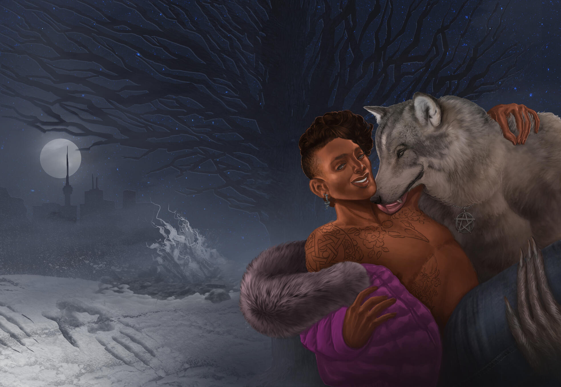
Queer Werewolves Destroy Capitalism (Wraparound Cover)

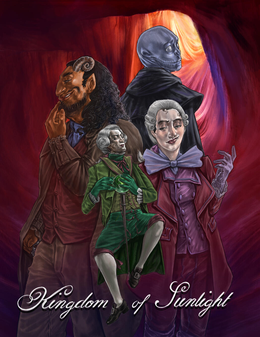
Kingdom of Sunlight (Interior Comic Cover)

Barrie Encampment Support Network (BESN) Campaign Illustration

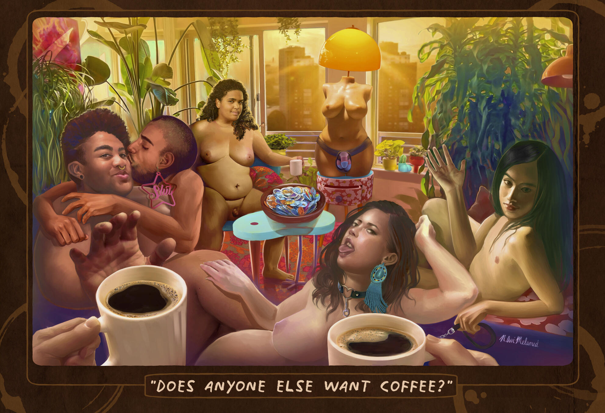
"Does Anyone Else Want Coffee?"
Erotic Arts & Crafts Fair Poster
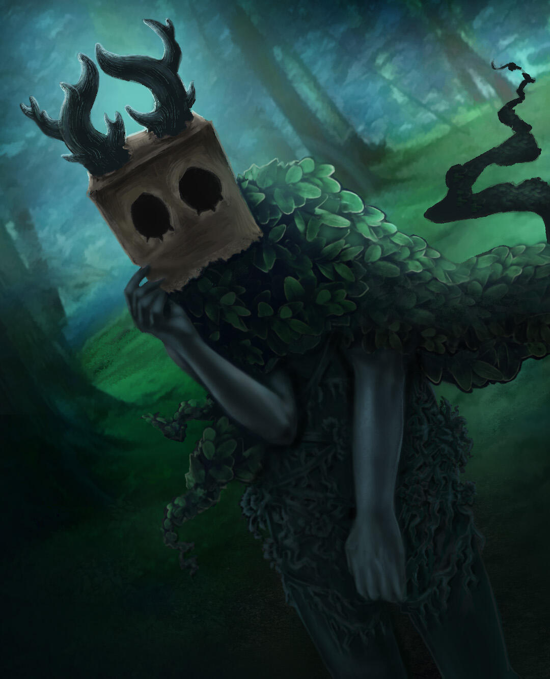
The Inverted Spire
"Read minds. Form alliances.
Break them.
Find true companionship.
Make true enemies.
Become what you always wished to be,
or succumb to your darkest urges.
Anything is possible
in the uncharted depths of the Spire."
In-game Art & Animation
I created photorealistic black-and-white painted artwork in Photoshop and Clip Studio Paint and added subtle animations using moving 2D layers and ATL transforms.
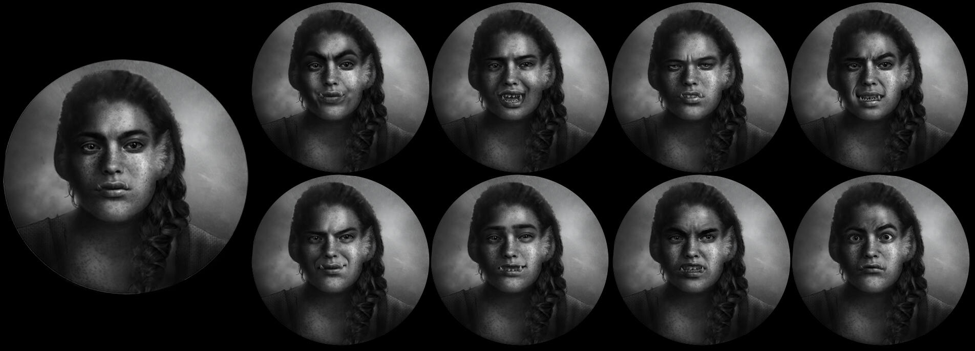
The HUD features a series of animated character portraits that selectively focus in/out and respond to in-game conversations.
A step-by-step process of painting evocative facial expressions can be found here.
Building the UI
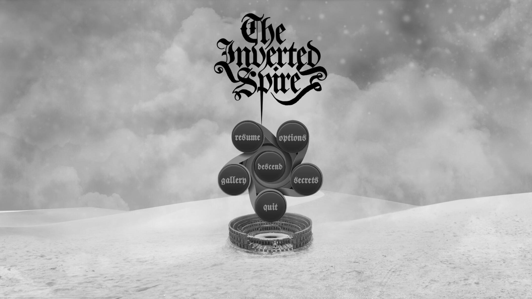
The Inverted Spire's menus are comprised of intricate moving designs. They aim to reflect the worldbuilding without feeling visually overwhelming.The main menu is built with a seamlessly scrolling layered background, animated buttons, and an animated transition that simulates the player "descending" into the spire when a new game begins.
A stylized journal keeps track of all the secrets and snippets of lore the player accumulates over a single run. It is integrated with in-game notifications to update the player when new entries are added.Other reusable UI elements can be seen throughout the screenshots below.
Concept Art
The Inverted Spire takes place in an original world rich with lore. I draw and write about this world simultaneously, with an eye for necessary details to bring the branching narrative to life with accompanying visuals.Concept art is drawn in a sketchbook, and later polished digitally.
Here is a dev log illustrating the way worldbuilding, writing and concept art work together behind the scenes to deliver the impression of a living world.Other dev logs discuss my worldbuilding and narrative design influences from working in backstage theatre, favourite speculative fantasy fiction, and a legacy of experimental games that focus on character relationships.
Developed with the help of Qweerty's 2022/2023 Victoria Kennedy Microgrant.
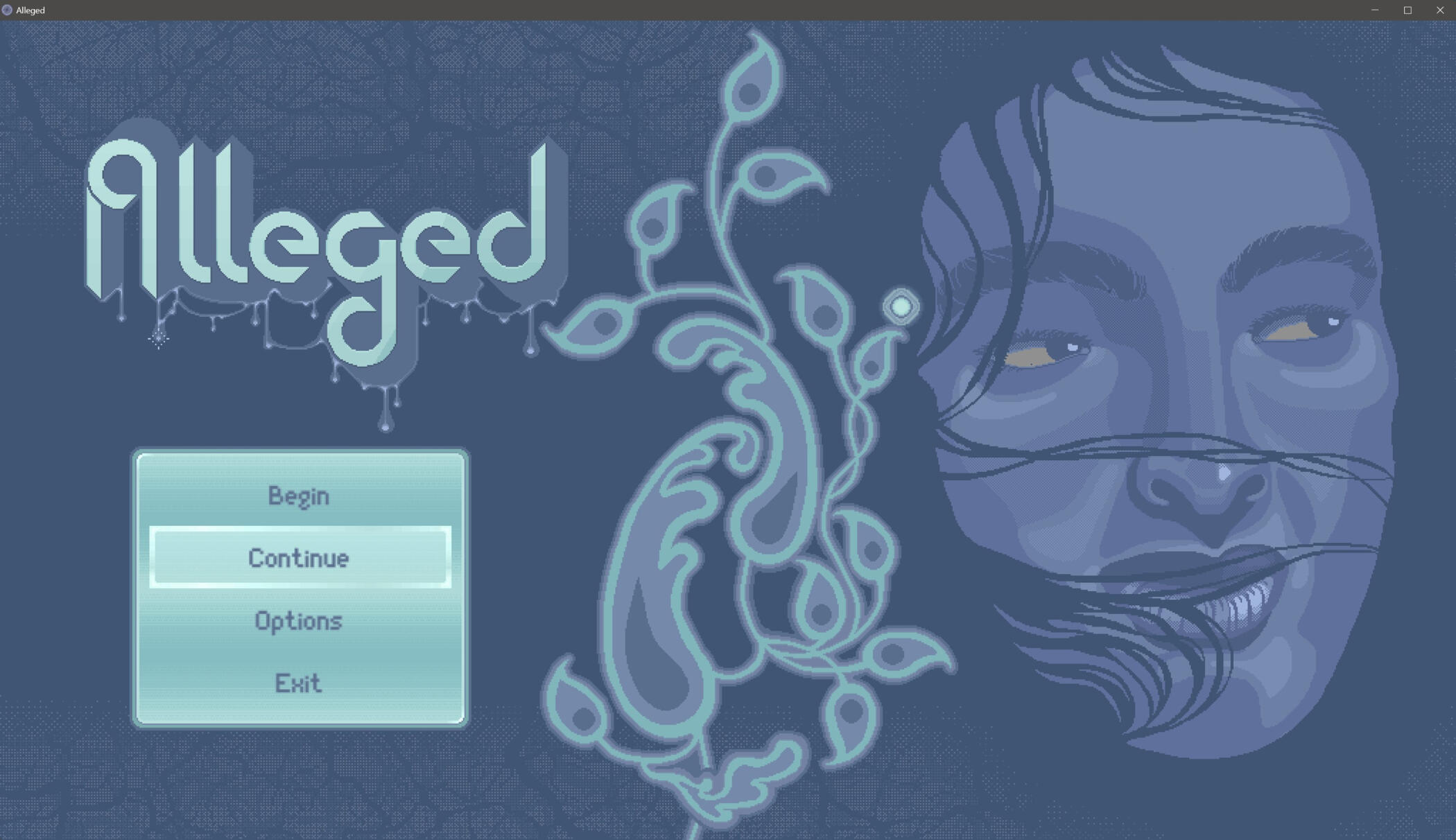
Alleged
In-game Art & Animation
I drew and animated all in-game assets in Asesprite and Clips Studio Paint EX. I then assembled them in the Tiled Map Editor and exported to RPG Maker with the help of the VisuStella Tiled Plugin.I also created a tile-based overlay lighting layer to simulate the appearance of walking through an environment with a lighting system.
Although the prototype is not currently available for download, early examples of the animated main menu, opening cutscene, and an early example of movement in the game environment were uploaded to youtube in 2023 at the selected links.The screenshots on this page represent a more up-to-date version as of 2025.
Environment and Level Design
Alleged environments are comprised of layered 32-bit tilesets.
The entire game is designed to take place in a single building.A cold, muted colour palette and detailed textures combine to evoke the feeling of traversing a brutalist institutional building erected in Toronto in the mid-70s.
I created animated UI elements to bring the HUD and other menus to life.
Pop-bubbles signal the presence and type of interactable element at any given tile.
The bubbles are designed as a QoL feature to mitigate possible frustration while searching for interactions in a high-detail pixel art environment.They appear dynamically appear as the player traverses a level.
Developed with the help of the 2023/2024 Pixelles Prototype Fund.
Bizarre Beast Boutique
Game jam project made during the one-month Amare Jam in 2022.
UI Design & Template Building
I designed modular UI elements and promotional/landing page art in Photoshop & CSP based on collaborative art direction. I then used these elements to develop an animated GUI template for all of the in-game menus.
I used these elements to develop an animated GUI template for all of the in-game menus. Transition and particle effects were created using ATL (the Python-based Ren'py Animation and Transformation Language).
Painted Environments from Sketch to Final
— Example I: The Storefront —
— Example II: The Backroom —
Collaborative Monster Designs
I developed concepts for petshop creatures that Feardeer coloured in a painterly style to match the environments & UI elements.
Books & Comics
I am both the writer and illustrator on all the projects listed below. Publications where I was only the illustrator or cover artist are not featured on this page.
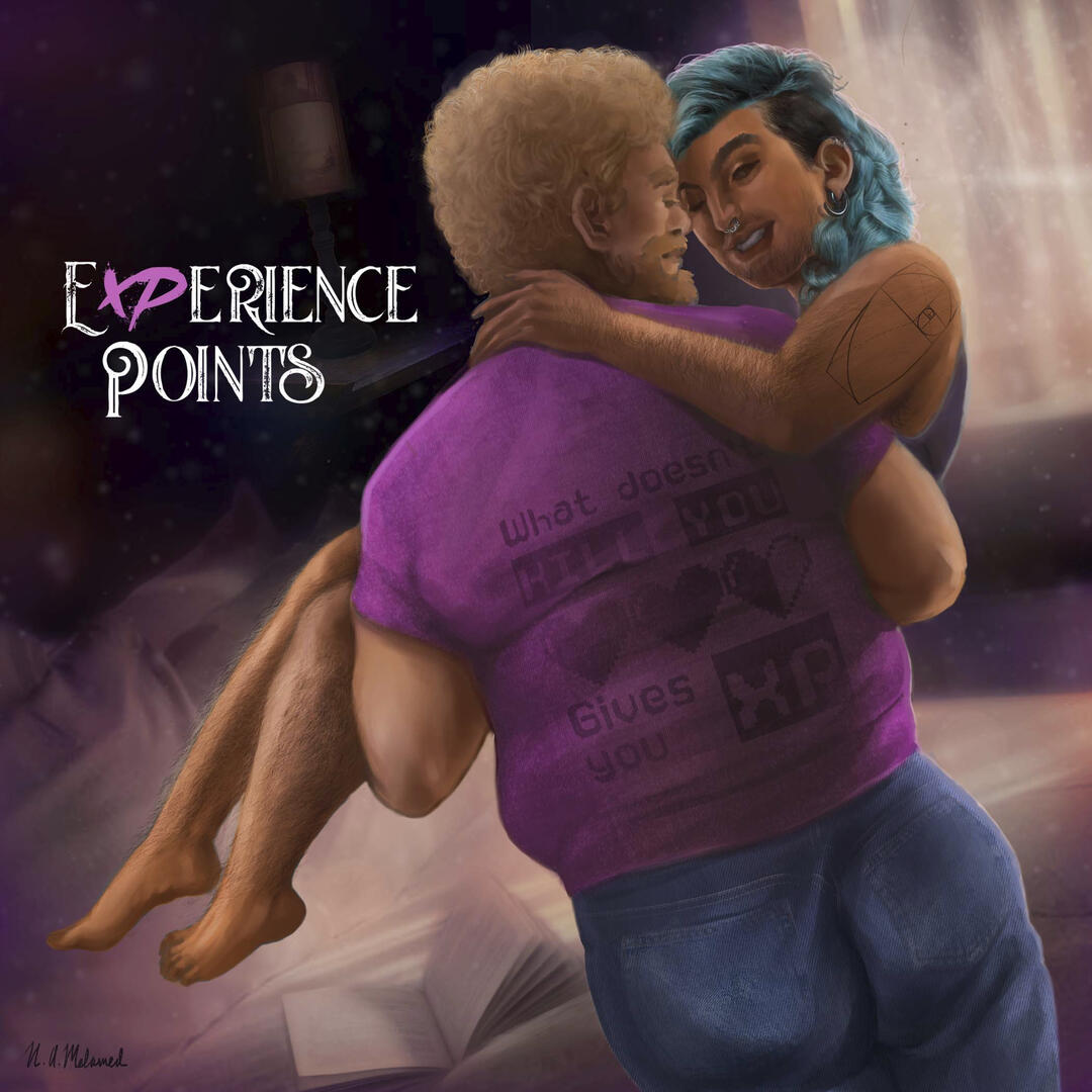
Experience Points
A queer, trans-centred adult romance novel with 60+ original illustrations. Published by Microcosm in March 2022 as both a series of zines and a collected edition with additional content.
Synopsis
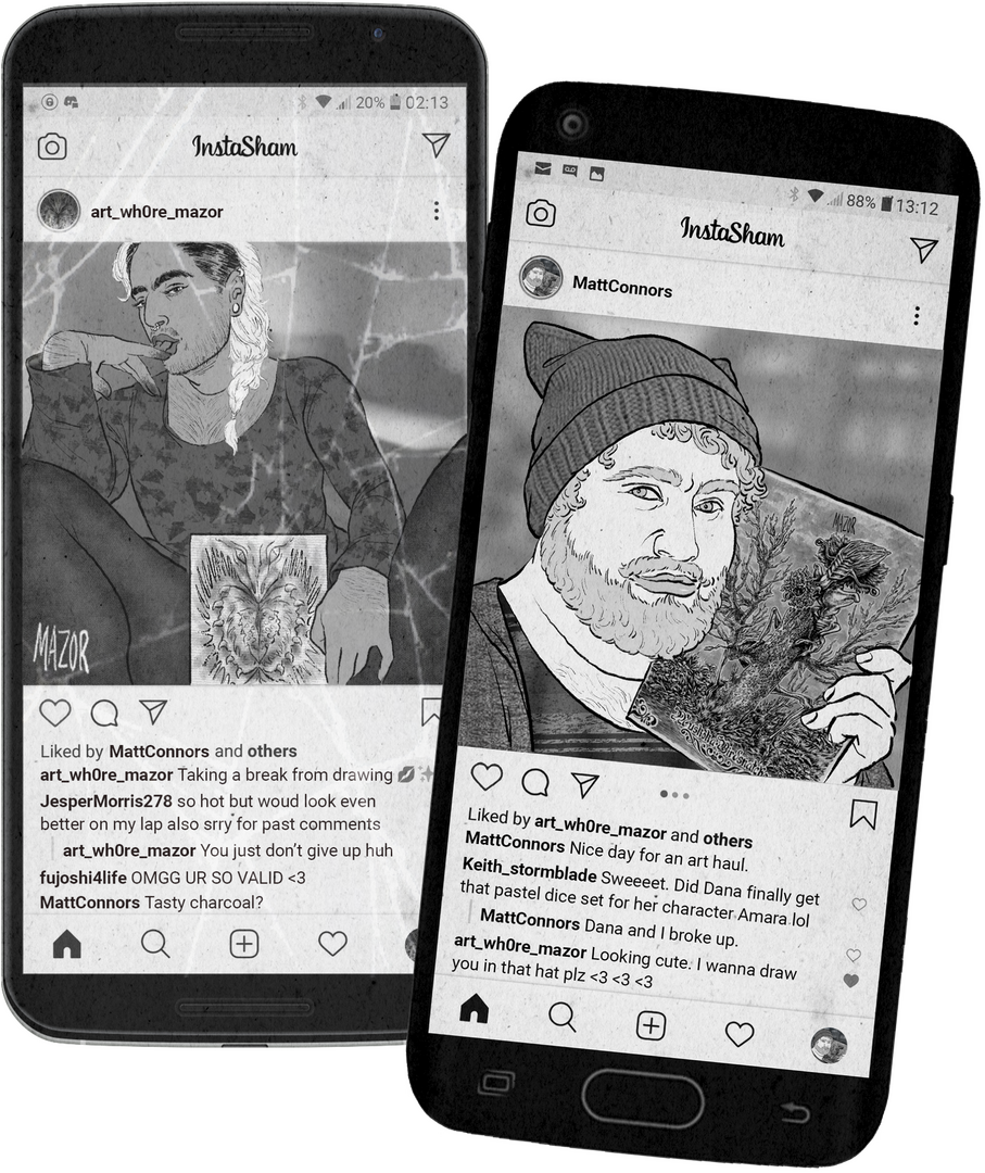
"Alex Mazor is a transmasculine horror artist struggling to make a living in Toronto. When he invites one of his patrons home to model for his next project, his motives aren't purely artistic. But Matt Connors, local fantasy geek and perpetual DM-without-a-party, is an unlikely model and an even stranger bedfellow.Follow along as their relationship unfolds, from a steamy modeling session to some exhibitionism at an art exhibit, and a road trip that pushes the pair to bring their trust to a new level. In the midst of exploring one another’s kinks and insecurities, will they be brave enough to find intimacy as well? This series of unapologetically filthy, nerdy, artistic encounters chronicles two lives at a crossroads of healing and self-discovery."
Autobiographical Mini-comics
An ongoing series of journal comics created for zines and social media.
On Trans Rights
On Found Family
On Ukraine
On Social Distancing
The Fable of Farlaf the Boastful
A comic that acts as a queer, anti-imperialist reimagining of an excerpt from the epic poem Ruslan and Ludmila by Alexander Pushkin. Progress on this project received a grant from the York Region Arts Council in 2021. More about the intentions and process work behind the comic can be found here.
You are my home
An autobiographical comic for the Home Sweet Home anthology with Corn Maze Press. It is, in concept, a love letter.
Kingdom of Sunlight
A longform comic project. Kingdom of Sunlight is a character-driven fantasy of manners that takes place in a fictional underground colony. Examples of the full-colour original style used in the the webcomic, and the new, ink-based style later adapted for print can be seen below.
Original Webcomic
Print Variant
Torontovka
A queer urban horror story created for the Shout Out Anthology published by TO Comix Press.
Synopsis
“Sasha is a young, closeted trans boy, living in an aging apartment building in the Torontovka neighbourhood of northern Toronto. The elevator's out, and Sasha wants to visit his friend on another floor: but that means confronting the entity in the stairwell.”


